


Conceptual team project at General Assembly to deliver web and mobile MVPs to increase brand awareness and customer engagement by delivering a transparent experience allowing users to monitor and react to their energy usage.
Platform: Mobile App
My Roles: Research, Prototyping, User Testing, Mobile UI Design
If you have looked your home's utility bill, we've all been there before: why was my bill so expensive this month? Opower understands these pain points and aims to alleviate them. Their data provides customers with information about their energy consumption, along with personalized ways to change behaviors to save money. But as a result of being behind the scenes Opower believes they are lacking in brand awareness and feels disconnected from the customer. The goal: a direct to consumer product that customers can associate the Opower brand with. To tackle this problem our team decided to develop a web and mobile app that allows customers to view their energy usage patterns in real time so they can make timely adjustments to save more money, and the earth!
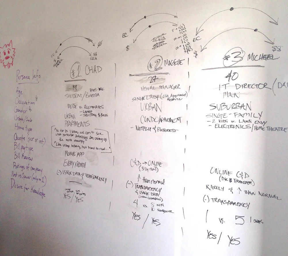
Our first step was to define our users. We conducted user interviews and surveys to collect responses on consumer energy usage, their desired features, and pain points when it comes to their utility companies and it’s offerings. Our group reviewed data from surveys and interviews resulting in common patterns to generate three key personas: the college student, the young professional, and the family man, all of whom would benefit from various features of our product.
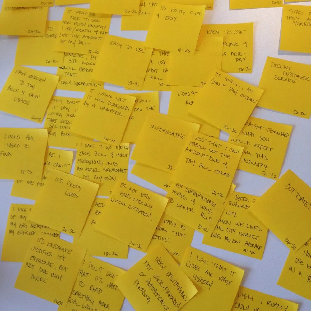
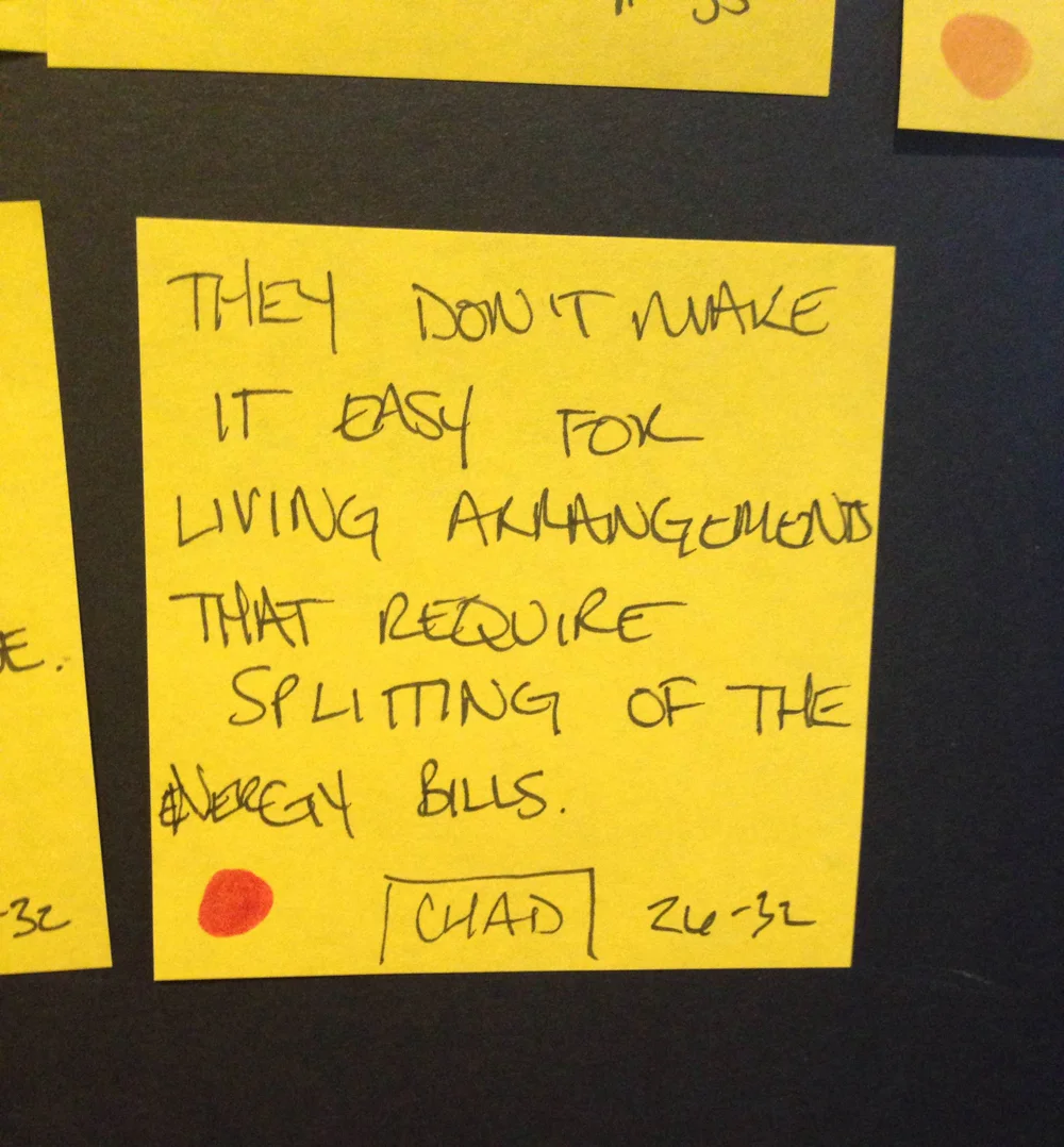
From our survey data we were able to collect positive comments along with pain points that we organized onto a feature prioritization board to visually filter out the most important user needs. Most comments were related to pain points concerning each user's experience with their current utility company.
After analyzing all comments we placed them into categories pertaining to issues of energy usage, bill pay, and usability as these were the most common themes we found. Our feature prioritization board allowed us to map out and pinpoint what features we wanted to pursue.
To effectively launch a direct-to-consumer product it's important to understand where success can most likely be executed. We conducted competitive analysis research to discover possible opportunities where Opower can execute their services against competing companies such as WeMo, Insteon, Revolv, and Alarm.com. Across all competitors we wanted to compare hardware based companies vs. software based companies, companies with a weak brand presence vs. strong brand presence, data-centric products vs. remote controlled products, and products with narrow user bases vs. broad user bases. With this approach we were hoping to identify which areas Opower could be successful where other companies may lack.
At the conclusion of our research we established that the primary goals of our MVP are to allow customers to view patterns of their current and past usage, set alerts for when their usage may bring them over their average monthly budget, and a painless method to split utility bills among housemates.
To begin ideation on UI, our team held a design studio session to conceptualize our designs via multiple rounds of sketching. I took lead of the mobile experience of our application and conceptualized the dashboard a customer would encounter upon launch of the application.
Sketches were turned into hi-fi wireframes that we used to create a clickable prototype in preparation of usability testing our key mobile flow. The goal was to illustrate an easy and quick method of bill pay between housemates, a prevalent pain point discovered during user research. This flow was most relevant to our persona Chad, the college student. I led all testing of the mobile app.
The following hi-fi wireframes and video below demonstrates this key user flow.
The screens below display the launch page of the app where a user can scroll down to find the bill pay section. The main account holder is highlighted by default.
Once all account members are selected the bill pay flow offers the option of submitting or restructuring the payment. If the user decides to restructure, the app will keep track of what is left for the remaining balance to prevent discrepancies and allow the user to edit appropriately.
The confirmation screen will display that payment has been submitted then allowing the user to navigate back to the main screen where it will now indicate that payment was completed.
Below is a prototype video demonstrating Chad’s use case.
The goal for our product was to utilize the current strength of Opower- access to real time data– an area that other competitors could not offer. This would enable Opower the ability to use this product to generate more business development with other non-participating utility companies. Opportunities for utility companies to retain their customers and alleviate their pain points through an exclusive service from Opower was an additional selling point we believed we achieved. What resonated with me most during the entire process was the discovery of pain points users were passionate about. Uncovering the “ah ha” moments can advance the potential of a project and reinforce that the simplest solutions can go a long way. A reminder to never lose focus of user empathy no matter what your goals may be.