


Redesign project to improve the overall experience of an engagement platform that allows independent consultants and hiring managers to search, create, and communicate about new contract opportunities.
Platform: Web Application
My Roles: Led all design activities from conceptualization, wireframing, user testing, analysis, documentation, design reviews, and stakeholder presentations.
It was a common question that was asked when glancing at the UI of Connect 1.0. I was tasked to lead a complete redesign of the entire application to resolve a long list of complaints posed by the existing user base.
We kicked things off by conceptualizing as a product team once key MVP features were established by our product manager. In an effort to unify the vision I led an exercise involving key stakeholders that included the director of UX, product managers, developers and fellow designers. We performed sketching sessions for each key feature to capture the intended product vision of each individual. Takeaways from our session concluded with:
- All key features must be easy to interact with and discover.
- Create a more engaging experience through clean UI, effortless usability, and humane, interpersonal language.
- Establish and persist the new branding direction of MBO Partners.
The next step was to live inside Sketch to generate wireframes of our intended goals and vision. The wires below depicts a hiring manager’s use case managing opportunities and communicating via messaging.
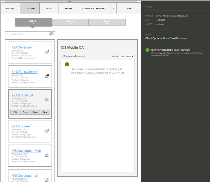
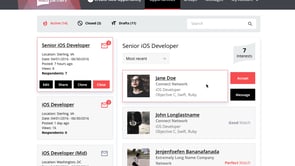
Our first step was to provide hiring managers a clean and simple view of their published opportunities and it’s applicants to allow for a quick and digestible workflow. Identifying quality candidates through match ratings, opportunity management, and quick engagement actions such as messaging or accepting an applicant were important features we wanted to prioritize.
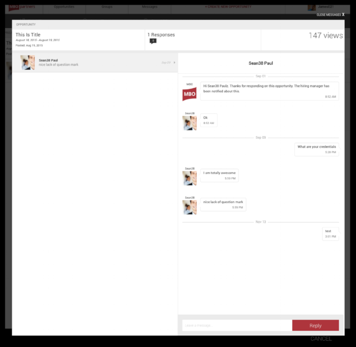
Messaging should be straightforward giving the user a clear orientation into which opportunity they're handling and who they're communicating with.
Another important goal for Connect was to present a light, interpersonal touch through engaging language as we all know the employment process can be taxing.
We went through multiple iterations and rounds of reviews before arriving to our finalized wires. During these reviews much of the evolution revolved around including additional details to strengthen a user profile and a larger variety of search parameters for opportunities.
Then handed off to our visual designer, designs were finalized through it's own process and ready for testing with the creation of high-fidelity prototypes in InVision.
Utilizing usertesting.com we released user tests to determine if hiring managers could manage their published opportunities through a script of given tasks. After analysis of 5 participants, all pertinent user tasks were deemed successful validating our design decisions. Our most important discovery found 3 users confused about the initial positioning of the search bar as it seemed out of context and unclear. Users were unsure if search applied to just opportunities or the entire page. A design decision was made to unify the top navigation and the search bar together to communicate that search is relevant only to opportunities (can be seen in prototype video below.)
From there we were able to move on from...
Below is a quick video demonstrating the happy path a hiring manager would experience while using Connect 2.0 to manage their opportunities. Take a look!
At that point in my design career, tackling a full-stack design project from ideation to shipment was an awakening experience as a green designer. Aside from applying UX theory, discovering new UI conventions, and an improving Sketch acumen, what was equally important was the internal project management lessons that are encountered at this type of scale even if it wasn’t in the job description. Timing had it that when Connect suddenly became a high priority at MBO Partners, there were roadblocks that stood in the way such as critical product/roadmap decisions and stakeholder influence. But building a successful product is born out of synergy between design, technology, product, and leadership. Out of the process came the chance to develop the ability to tell the same story in ways each stakeholder can effectively understand. Selling my work was half the battle and I'm grateful to have received the opportunities to do so.