


Team project to deliver an MVP mobile app to increase brand awareness, number of downloads, and improve listener engagement. The show averages anywhere between 8,000 to 12,000 downloads a week.
Platform: Mobile App
My Roles: Research, Prototyping, Testing, UI Design, Stakeholder Meetings
Well there's an app for that, sort of. Chris Stemp and Jon Rojas are two smart guys who want to satisfy your curious mind. Hosts of the weekly Smart People Podcast, they aim to hold conversations that range in topics from leadership skills to monkey migration.
After an extensive client interview, we committed to building a mobile MVP (minimum viable product) based on the realization that most of their regular fans listen through their mobile device based on survey data they provided. We believed a mobile first approach would promote a solid foundation for future improvements of their existing website.
Findings during a competitive analysis allowed us to narrow down potential features applicable to SPP. Queuing features from the “Planet Money” podcast app allows users to save podcasts to listen to later. A strong approach to content strategy from “The Art of Manliness” blog was mentioned by Chris as an inspirational model to follow.
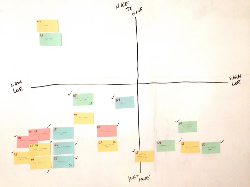
Below is a feature prioritization board that we utilized to sort out and narrow down which features we wanted to pursue based off of our findings. Each feature was based on low to high levels of effort, and what we deemed as nice to have vs. must have after speaking with developers to gauge feasibility. After the exercise, all features ended up following three common themes relating to listener engagement, solid UI, or self improvement.
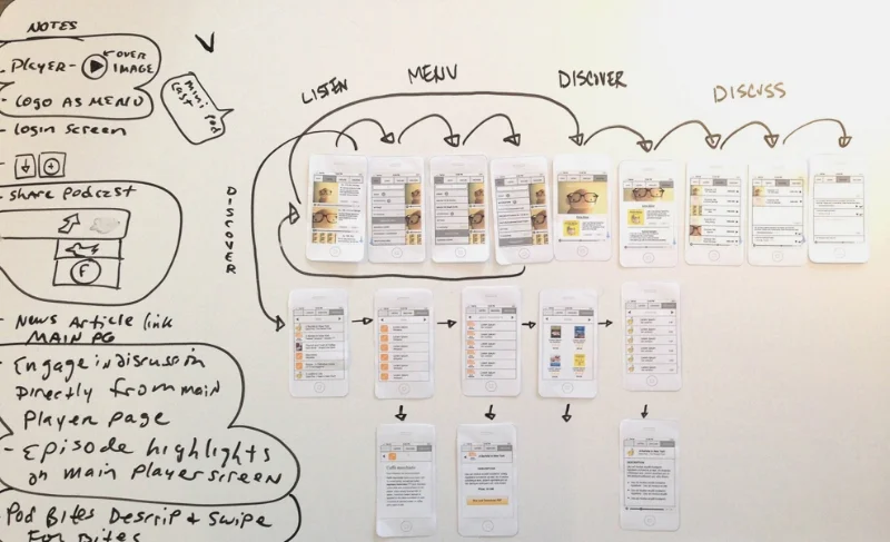
The decision was made to highlight three key experiences within the app: listen, discover, discuss. Based on patterns we discovered from user interviews of several podcast consumers, we were able to generate three levels of personas: the power user, the moderate user, and the weak user.
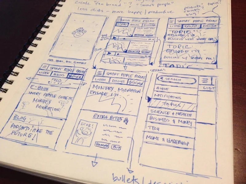
The sketches below capture the ideation reflective of our findings, leading to the creation of the wireframes and paper prototypes we used to test the flow of our key features.
We conducted three usability tests with users who fit into each of our key personas. During user testing we provided no guidance and held constant dialogue with the users to gauge their initial feelings on the flow and features as they interacted with the prototypes. During this process I facilitated discussion on how the user felt about their interaction to identify any pain points or feedback to take note of. As a result of the feedback we were able to identify adjustments needed to the user flow, resulting in 5 additional screens.
Below are the high fidelity mockups that I produced bringing together the vision and design decisions of our MVP. The screens highlight the key features of our app that aim to alleviate the problems raised by both Jon and Chris and their listeners.
Notable features include swiping gestures to queue and download episodes locally, a fixed media player at the bottom of the screen to minimize browsing disruption, an “Extra Bites” feed that holds relevant content and information to each episode, and the ability to interact with other fans through a discussion thread feature.
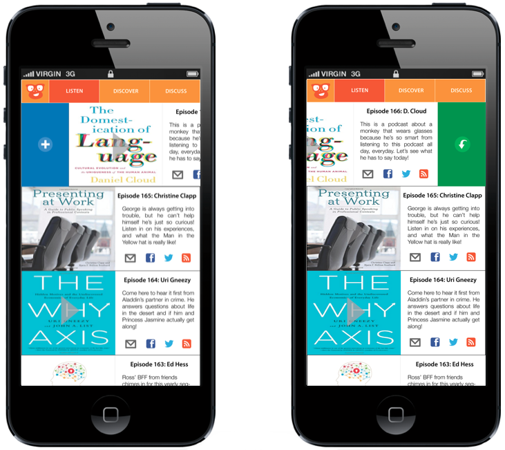
The following screens illustrate queuing and downloading gestures. Swipe left to download an episode, or swipe right to add it to your listening queue. We wanted to emphasize quick, instinctual gestures for our mobile experience.
The first screen below illustrates an individual episode page once an episode is being played. You'll notice a media player that stays fixed at the bottom of the screen during app navigation along with relevant content associated with the episode. The second screen depicts a feed of relevant content in the "discover" section pertaining to each episode such as articles, ebook transcripts, and books.
Below, the first screen displays the ability to toggle through "discover" categories such as books. The second screen is an example of the "discussion" section and the conversational engagement users can participate in for each episode.
If given the opportunity for continued development of the MVP, we would propose more opportunities for content discovery and listener engagement. With that said, our team was confident that we identified the fundamental cornerstone features that would lead the way for more innovation and improvement. You can't design the GPS system without designing the car first, and we hope this is a car that Chris and Jon can ride to maintain a relationship with their listeners.
"Matt & Jen far exceeded my expectations with their client project and presentation. Not only did they provide Chris and I a beautifully designed mobile app, but they went above and beyond to create a content strategy that will help Smart People Podcast move closer to our mission and vision. I would recommend Matt & Jen to anyone looking for a professional, creative, and truly wonderful UX Designer."
- Jon Rojas, Smart People Podcast